Skysnap provides an optimized viewing experience for window seat passengers on flights from seat selection stage to in-cabin stage. Passengers with or without window seats would all be given the maximized opportunity to enjoy the sceneries along the trip.
(Background)
Airplanes are becoming the most popular and common transportation nowadays. Passengers are taking more attention to the experiences in the cabin due to certain constraints. There are still lots of concerns for passengers in flight which are overlooked by current products, it is worthwhile to figure out potential needs for a certain group of passengers and fill the gap.
(Problem Space)
Optimize the viewing experiences on the plane for the window seat passengers and help attract potential customers to sell the flight tickets.
(process)
The goal of the research is to find potential needs for most passengers and improve one certain experience in the cabin. Through the whole process of the project, I engaged as much as possible inputs from target users and stakeholders by conducting surveys and interviews, secondary research, ideation, prototyping and usability tests to figure out their pain points and needs to deliver my design decisions.
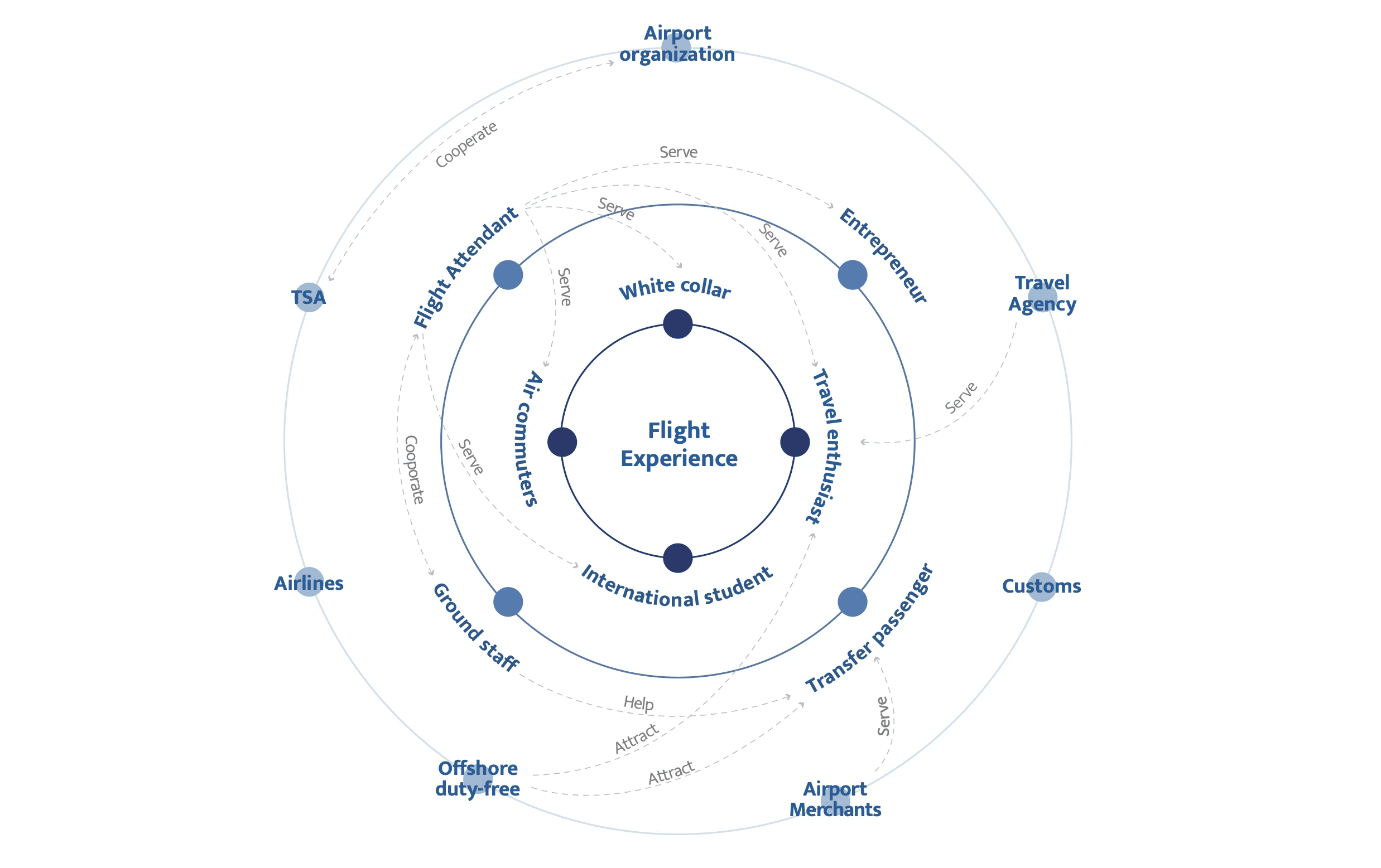
(stakeholder map)
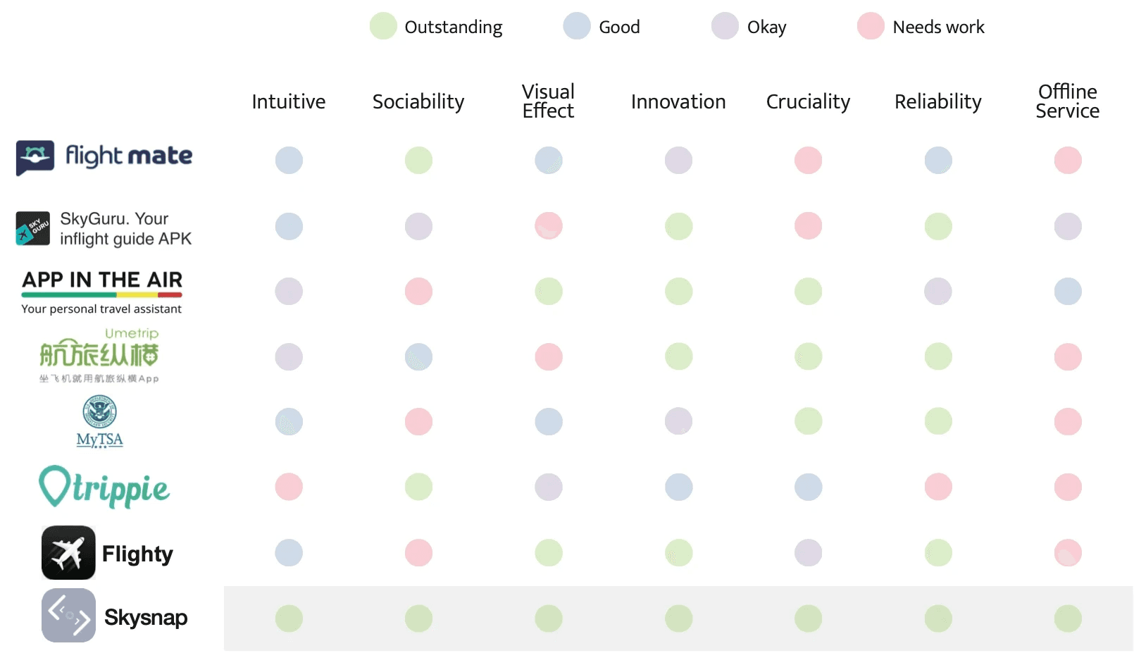
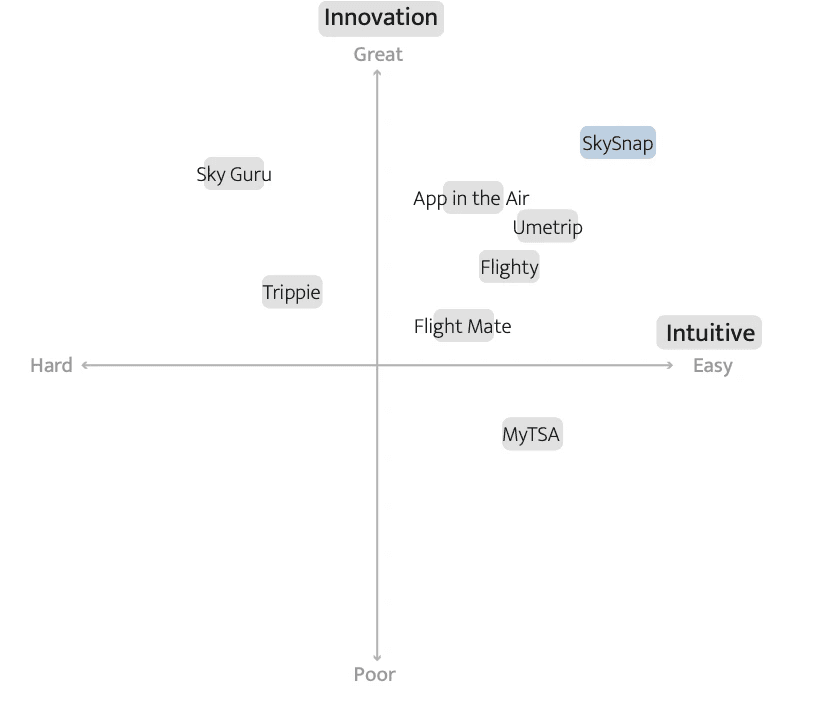
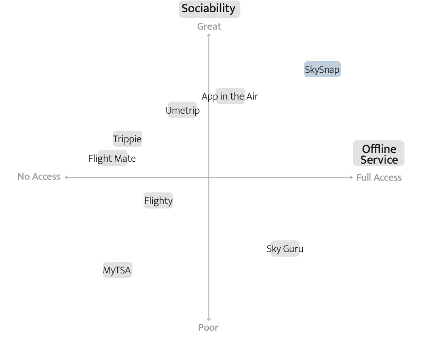
(competitor analysis)
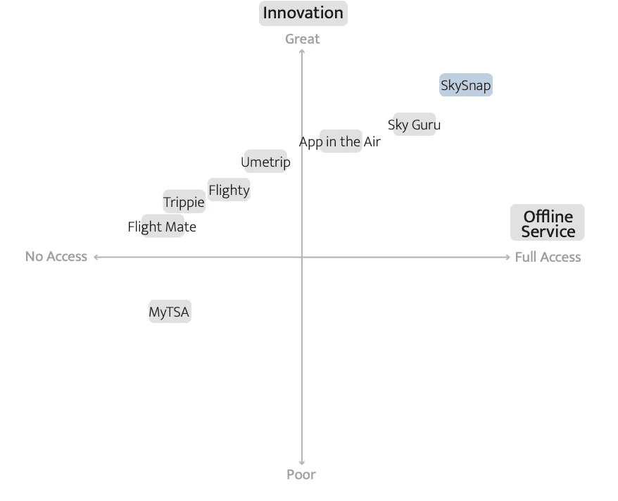
(positioning map)
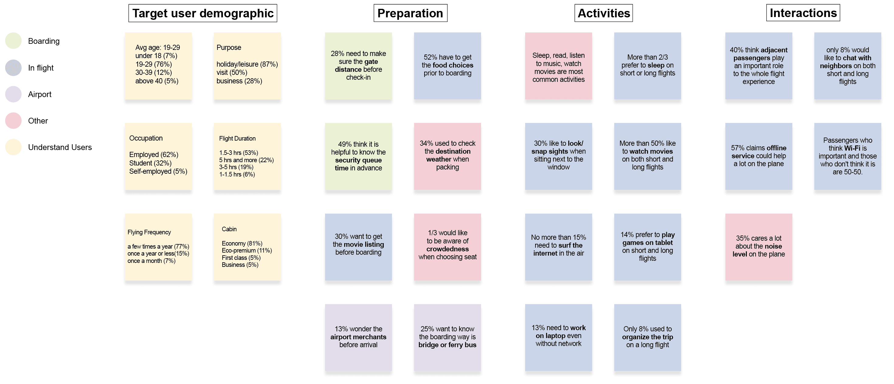
(survey & interviews)
(takeaways)
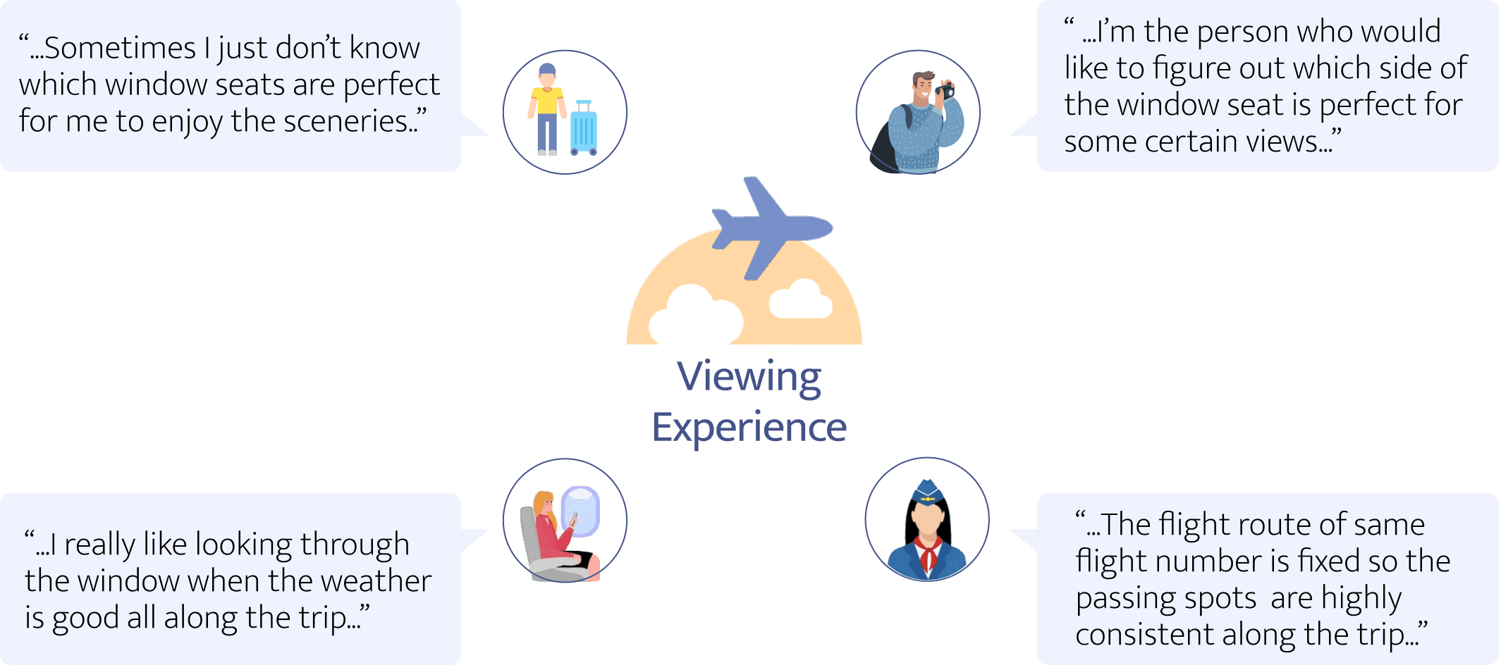
Overlooking the scenery on the plane is a unique experience for almost every passenger. (When talking about the scenery through the airplane window, most of them tend to be excited to recall what they have seen while someone even specifically chooses the window seats for sunset scenery.)
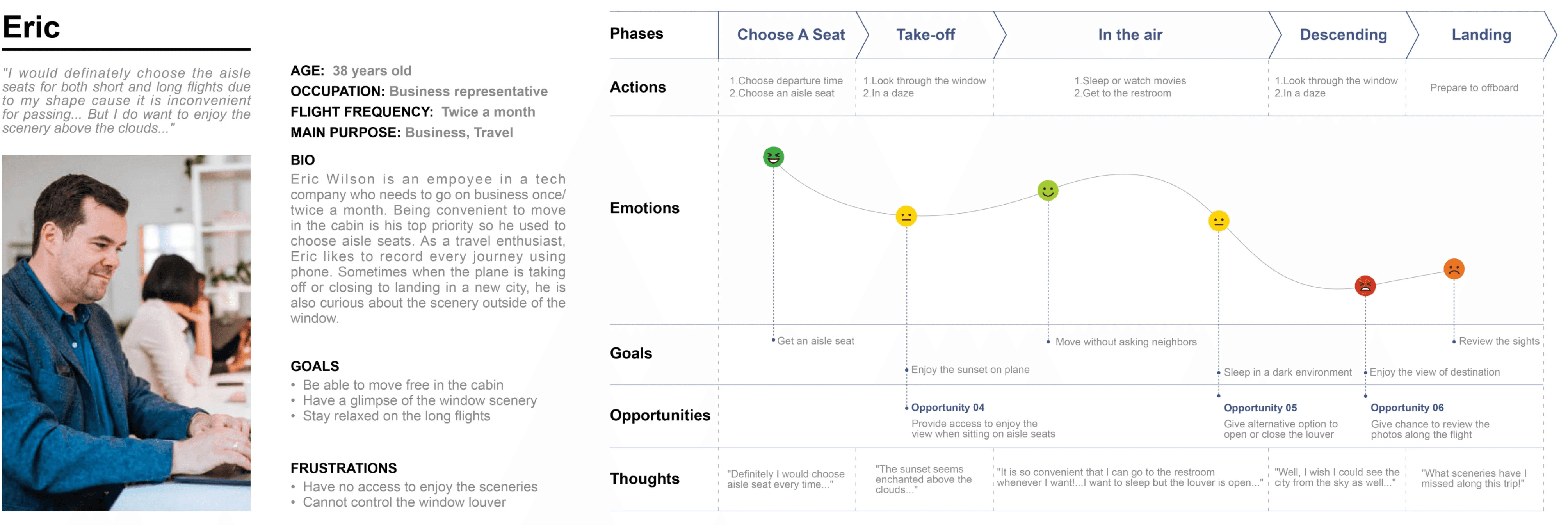
(Persona & journey map)
(opportunity statement)
(transition into product requirements)
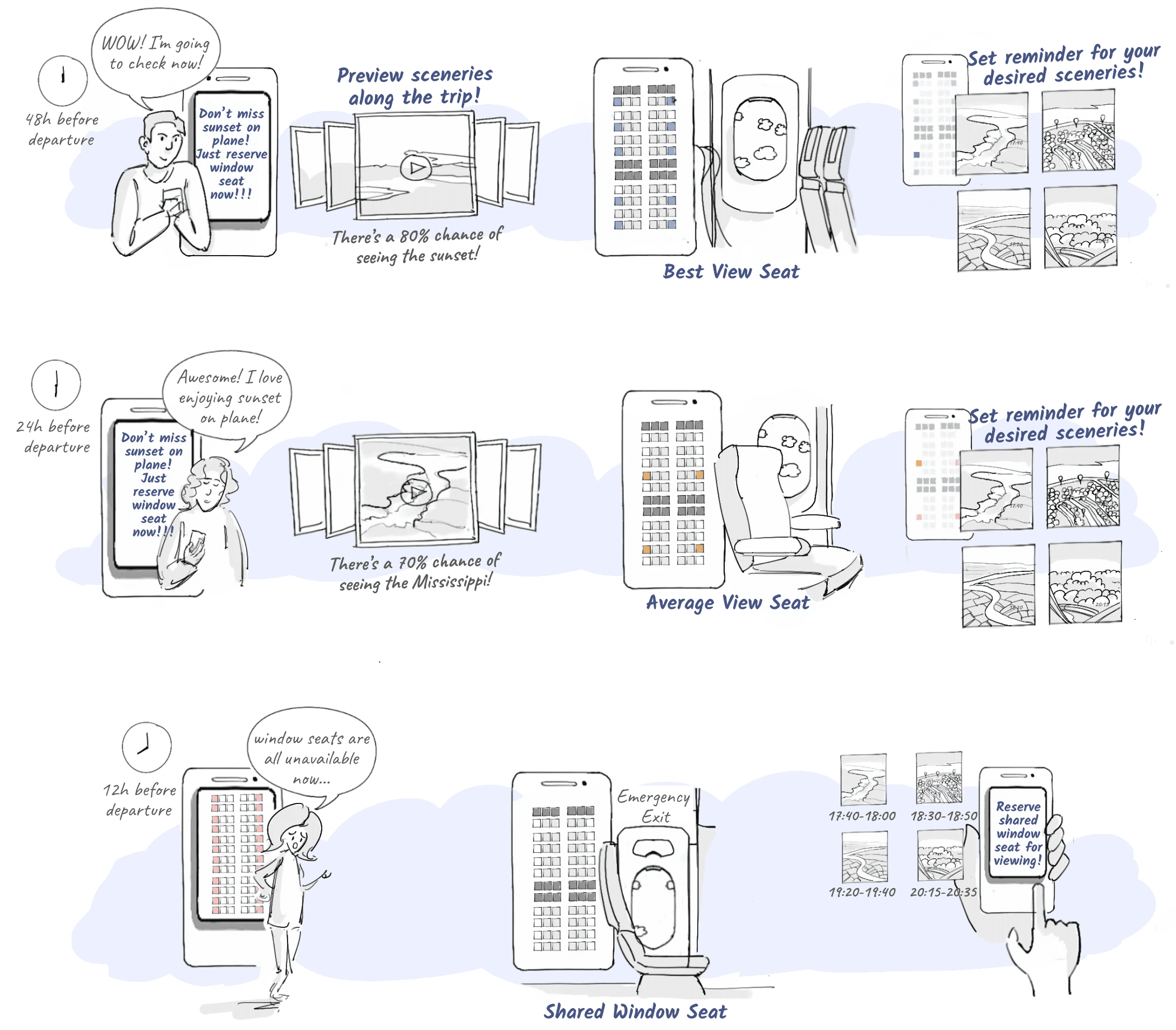
(storyboards)
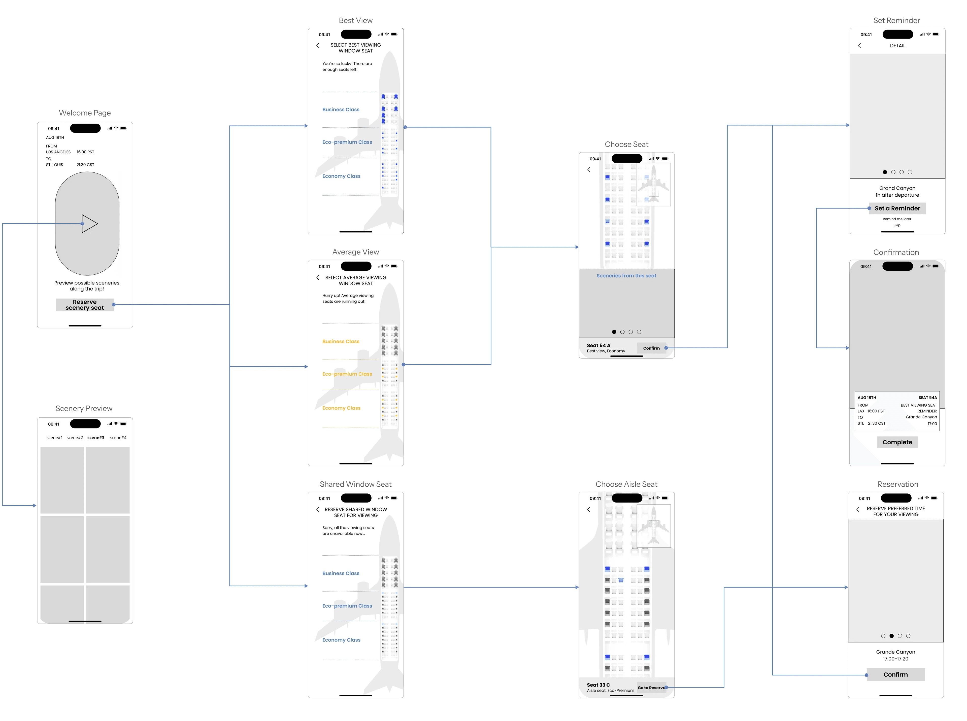
(users flow)
(low fidelity prototyping)
This prototype aims to display the features for passengers with or without window seats to enjoy the scenery without worries and concerns after adding the feature of scenery preview and scenery reminders. Basically, this prototype only shows the user flow from seat selection to confirmation page.
(iteration)
After I finished the 1st round of prototype, I quickly reflected on the journey map to see whether the 3 problems had been solved. I also got constructive comments from both users and UX designers which helped me get crucial insights:
User flow of reserving shared window seats is confusing.
Introduction of reminder service is not intuitive.
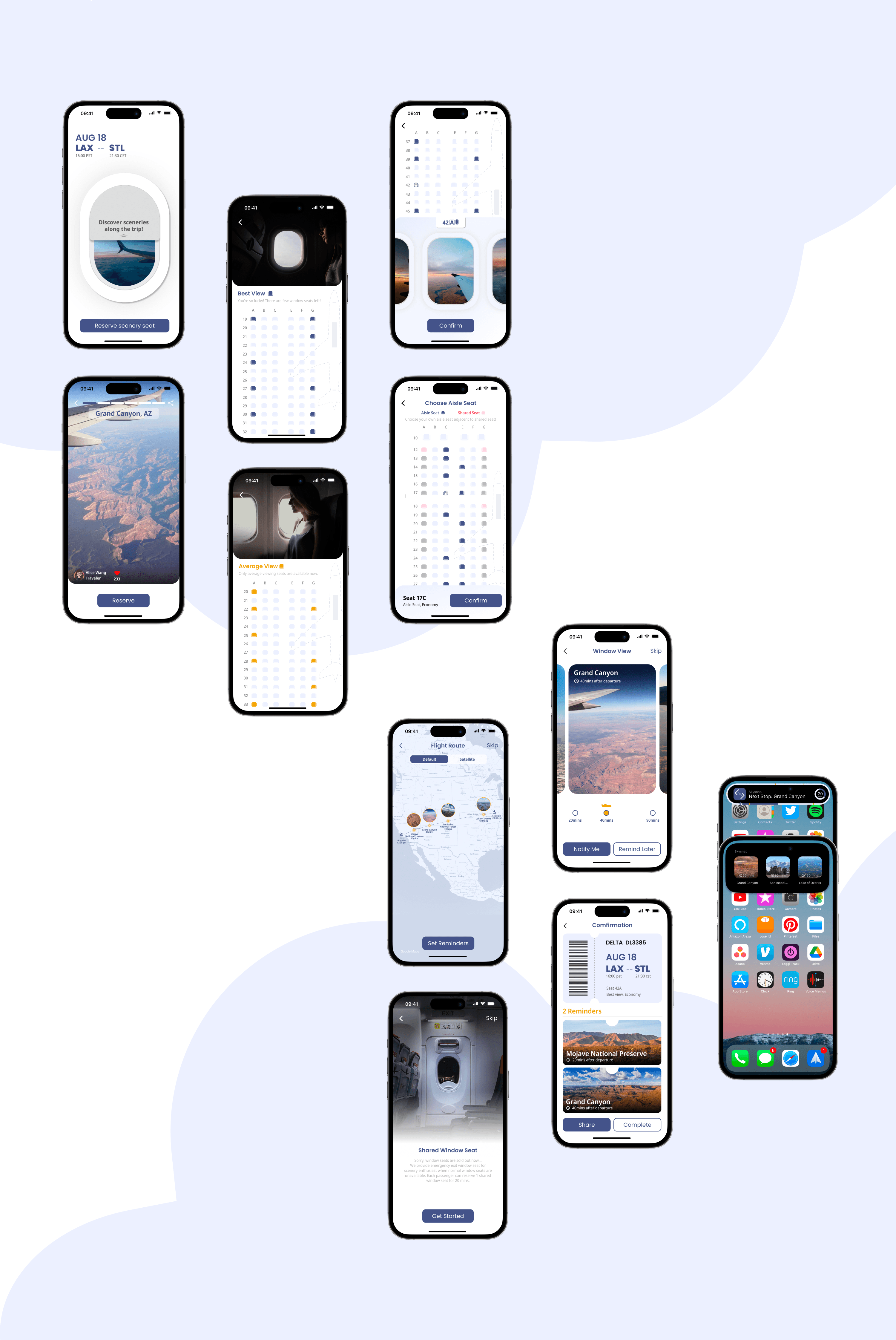
(High fidelity prototype)
After the first iteration, I improved some details and filled the gap of the prototype to make the Lo-Fi model complete as a Hi-Fi model. The changes are as follows:
Added an introduction page for the shared window seat service prior to the seat selection process.
Combined flight map with the scenery preview to introduce the reminder service.
Optimized the process of setting reminders and making reservations.
Optimized the confirmation page into card view.
Add a countdown shortcut for scenery reminders in Dynamic Island.
Since this project has not been practical launched, there is lot of space for commercial and marketing considerations. The most primary task is to connect with an expert in the airline business to verify the feasibility of current solutions and discuss about other possibilities.
